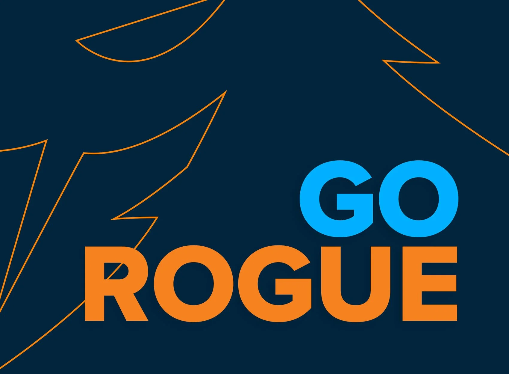
Rogue - Preserving the Past, Embracing the Future.
Rogue needed a brand evolution that honored its legacy while opening the door to a more global and inclusive future. We modernized their iconic hooded mark, refined the visual system, and kept the spirit fans loved, proving that growth doesn’t have to mean letting go of your origins.


The Challenge: Finding Clarity
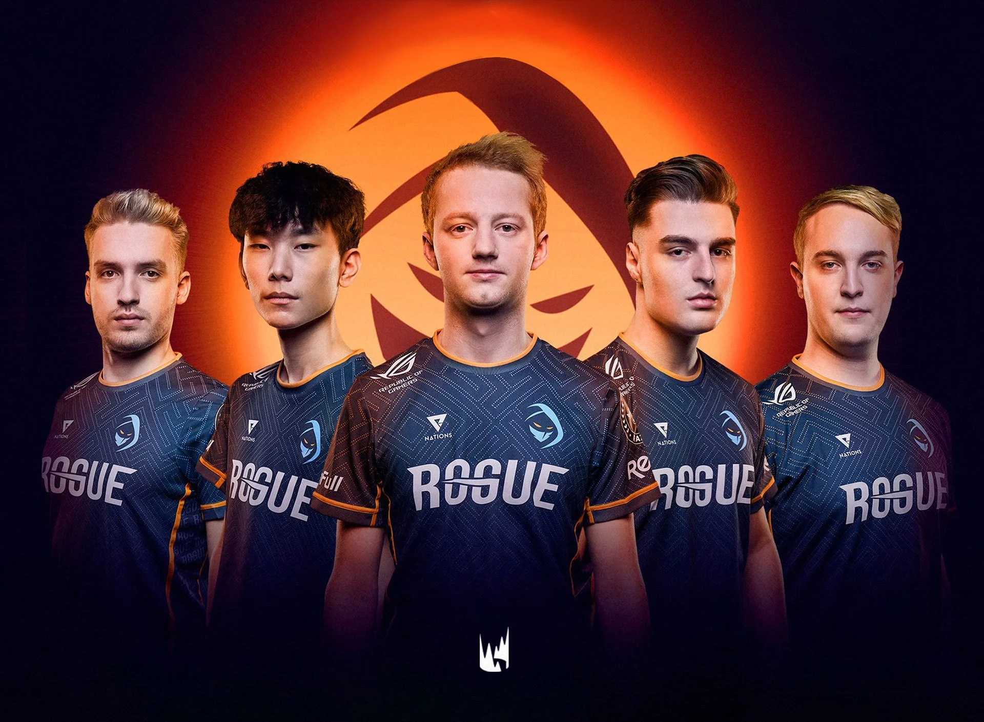
Rogue had a beloved fan base and an iconic logo, but the brand wasn’t keeping up with its growth. The old mark felt dated, overly masculine, and too detailed for a digital-first world. It didn’t reflect Rogue’s diversity or global reach, and fans couldn’t see a clear path forward for the brand they loved.


The Strategy: Evolving, Not Replacing
Feedback from players and fans revealed something important: Rogue’s strength lived in connection, not just competition. The hood and mask symbolized belonging, anyone could wear them. Our strategy focused on honoring what people cared about while refining the parts that held the brand back, evolving the identity without losing its spirit.

The Execution: Refining the Legacy
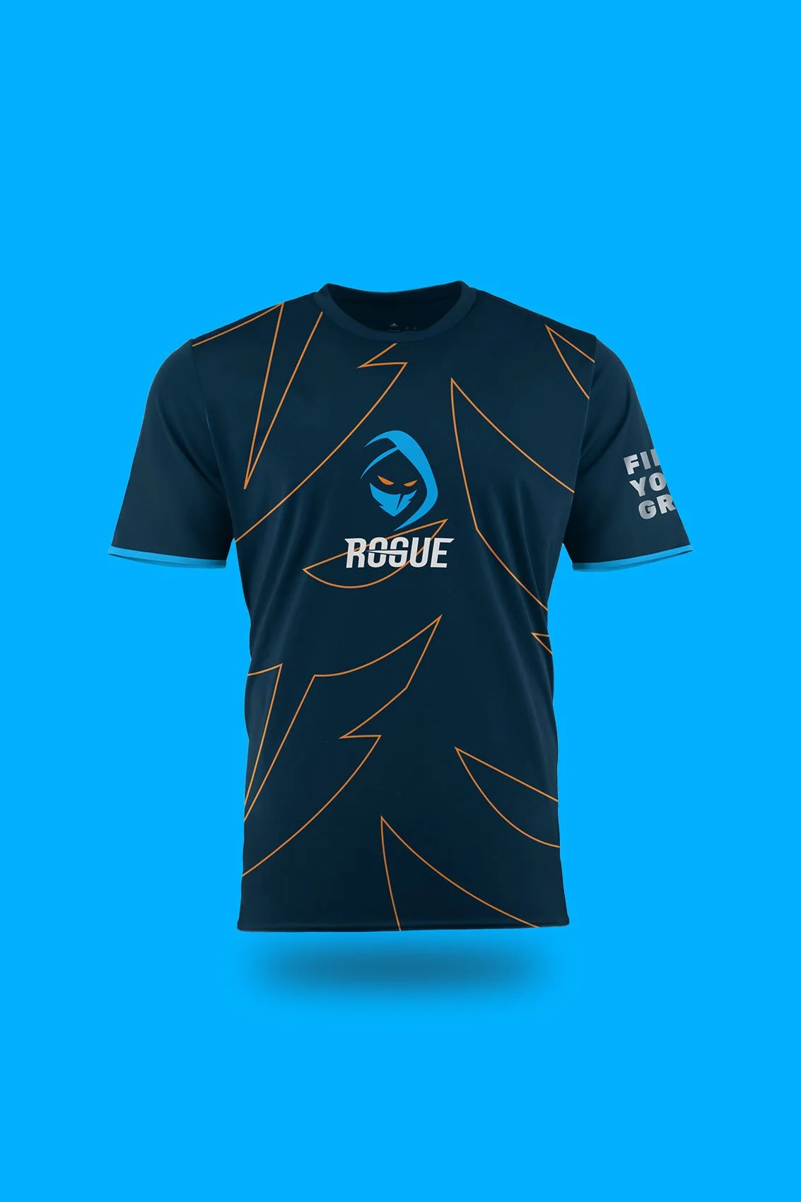
We updated the Rogue icon to be cleaner, sharper, and gender-neutral, keeping the recognizable hood and eyes while removing unnecessary detail. The refined blue palette and simplified shapes helped the brand feel faster, bolder, and easier to use across platforms. Every choice respected the legacy while preparing Rogue for what’s next.


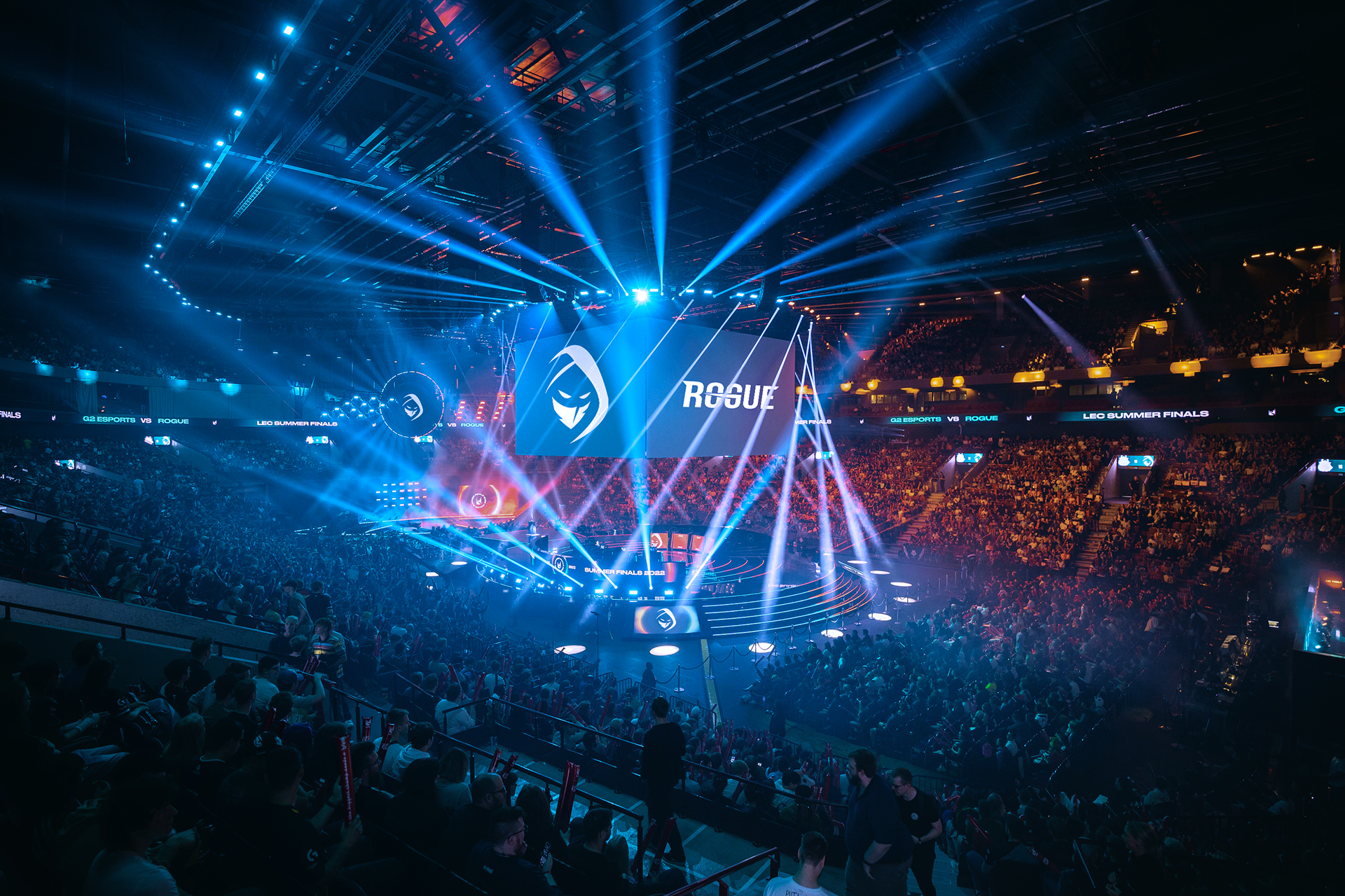
The Impact: Strength in Evolution
The refreshed brand felt familiar yet new, an update fans could embrace with pride. By strengthening what made Rogue iconic and presenting it with clarity and inclusivity, the team stepped confidently into a global future, illustrating that you can evolve without letting go of what started it all.